Tutorial
This tutorial covers basic usage of the Rosely package including
loading of data, calculatiion of wind statistics, and wind rose plotting
customizations.
>>> import pandas as pd
>>> import plotly.express as px
>>> from rosely import WindRose
Read input data
rosely requires wind data to first be loaded into a
pandas.DataFrame object, also wind direction should be in degrees,
i.e. in [0, 360].
The example data used in this tutorial is a modified version of 30 minute data that was originally from the “Twitchell Alfalfa” AmeriFlux eddy covariance flux tower site in the Sacramento–San Joaquin River Delta in California. The site is located in alfalfa fields and exhibits a mild Mediterranean climate with dry and hot summers, for more information on this site click here.
The data used for this example can be downloaded on the Rosely GitHub repositor here. And a Jupyter Notebook of this tutorial is available here.
>>> df = pd.read_csv('test_data.csv', index_col='date', parse_dates=True)
>>> df[['ws','wd']].head()
| ws | wd | |
|---|---|---|
| date | ||
| 2013-05-24 12:30:00 | 3.352754 | 236.625093 |
| 2013-05-24 13:00:00 | 3.882154 | 243.971055 |
| 2013-05-24 13:30:00 | 4.646089 | 238.620934 |
| 2013-05-24 14:00:00 | 5.048825 | 247.868815 |
| 2013-05-24 14:30:00 | 5.302946 | 250.930258 |
Or another view of the summary statistics of wind data
>>> df[['ws','wd']].describe()
| ws | wd | |
|---|---|---|
| count | 84988.000000 | 84988.000000 |
| mean | 3.118813 | 233.210960 |
| std | 2.032425 | 84.893918 |
| min | 0.010876 | 0.003150 |
| 25% | 1.442373 | 220.401528 |
| 50% | 2.731378 | 255.568402 |
| 75% | 4.517145 | 272.190239 |
| max | 14.733296 | 359.997582 |
Create a WindRose instance
Using the loaded wind speed and direction data within a
pandas.DataFrame we can initialize a rosely.WindRose object
which provides simple methods for generating interactive wind rose
diagrams.
>>> WR = WindRose(df)
Alternatively the dataframe can be later assigned to a WindRose
object,
>>> WR = WindRose()
>>> WR.df = df
Calculate wind statistics
A wind rose diagram is essentially a stacked histogram that is binned by
wind speed and freqeuncy for a set of wind directions. These
calculations are accomplished by the WindRose.calc_stats() method
which allows for changing the number of default wind speed bins (equally
spaced) and whether or not the frequency is normalized to sum to 100 or
it is just the actual frequency of wind occurences (counts) in a certain
direction and speed bin.
By default the freqeuncy is normalized and the number of wind speed bins is 9:
>>> WR.calc_stats()
To view the results of the wind statistics that will be used for the
wind rose later, view the WindRose.wind_df which is created after
running WindRose.calc_stats():
>>> # view all statistics for winds coming from the North
>>> WR.wind_df.loc[WR.wind_df.direction=='N']
| direction | speed | frequency | |
|---|---|---|---|
| 0 | N | -0.00-1.65 | 1.36 |
| 1 | N | 1.65-3.28 | 0.66 |
| 2 | N | 3.28-4.92 | 0.24 |
| 3 | N | 4.92-6.55 | 0.07 |
| 4 | N | 6.55-8.19 | 0.01 |
| 5 | N | 8.19-9.83 | 0.01 |
| 6 | N | 9.83-11.46 | 0.00 |
| 184 | N | -0.00-1.65 | 1.32 |
| 185 | N | 1.65-3.28 | 1.19 |
| 186 | N | 3.28-4.92 | 0.59 |
| 187 | N | 4.92-6.55 | 0.27 |
| 188 | N | 6.55-8.19 | 0.15 |
| 189 | N | 8.19-9.83 | 0.06 |
| 190 | N | 9.83-11.46 | 0.04 |
| 191 | N | 11.46-13.10 | 0.01 |
Note
The winds speed bins in a certain direction may appear to be duplicated
above but they are not, what is happening is that
WindRose.calc_stats() bins each direction on a 16 point compass twice
for 11.25 degrees sections on both sides of the compass azimuth. So for
North there are two internal azimuth bins: from 348.75-360 degrees and from
0-11.25 degrees. If you wanted to see the summed Northerly winds frequencies
within the 9 speed bins you could run:
>>> WR.wind_df.groupby(['direction','speed']).sum().loc['N']
| frequency | |
|---|---|
| speed | |
| -0.00-1.65 | 2.68 |
| 1.65-3.28 | 1.85 |
| 3.28-4.92 | 0.83 |
| 4.92-6.55 | 0.34 |
| 6.55-8.19 | 0.16 |
| 8.19-9.83 | 0.07 |
| 9.83-11.46 | 0.04 |
| 11.46-13.10 | 0.01 |
| 13.10-14.73 | NaN |
Here is an example of not normalizing the freqeuncy (using raw counts instead) and using 6 instead of 9 bins for speed. This example shows the same grouped output for Northerly winds,
>>> WR.calc_stats(normed=False, bins=6)
>>> WR.wind_df.groupby(['direction','speed']).sum().loc['N']
| frequency | |
|---|---|
| speed | |
| -0.00-2.46 | 3318.0 |
| 2.46-4.92 | 1232.0 |
| 4.92-7.37 | 366.0 |
| 7.37-9.83 | 121.0 |
| 9.83-12.28 | 38.0 |
| 12.28-14.73 | NaN |
Lastly, if the wind speed and wind direction columns in the dataframe
assigned to the WindRose object are not named ‘ws’ and ‘wd’
respectively, instead of renaming them ahead of time or inplace, you may
pass a dictionary that maps their names to the WindRose.calc_stats()
method. For example, lets purposely change the names in our input
dataframe to ‘wind_speed’ and ‘direction’:
>>> tmp_df = df[['ws','wd']]
>>> tmp_df.columns = ['wind_speed', 'direction']
>>> tmp_df.head()
| wind_speed | direction | |
|---|---|---|
| date | ||
| 2013-05-24 12:30:00 | 3.352754 | 236.625093 |
| 2013-05-24 13:00:00 | 3.882154 | 243.971055 |
| 2013-05-24 13:30:00 | 4.646089 | 238.620934 |
| 2013-05-24 14:00:00 | 5.048825 | 247.868815 |
| 2013-05-24 14:30:00 | 5.302946 | 250.930258 |
Now reassign this differently named dataframe to a WindRose instance to demonstrate
>>> WR.df = tmp_df
>>> # create renaming dictionary
>>> names = {
>>> 'wind_speed':'ws',
>>> 'direction': 'wd'
>>> }
>>> WR.calc_stats(normed=False, bins=6, variable_names=names)
>>> WR.wind_df.groupby(['direction','speed']).sum().loc['N']
| frequency | |
|---|---|
| speed | |
| -0.00-2.46 | 3318.0 |
| 2.46-4.92 | 1232.0 |
| 4.92-7.37 | 366.0 |
| 7.37-9.83 | 121.0 |
| 9.83-12.28 | 38.0 |
| 12.28-14.73 | NaN |
The same results were achieved as above, however the column names used
for initial assignment are retained by the WindRose.df property:
>>> WR.df.head()
| wind_speed | direction | |
|---|---|---|
| date | ||
| 2013-05-24 12:30:00 | 3.352754 | 236.625093 |
| 2013-05-24 13:00:00 | 3.882154 | 243.971055 |
| 2013-05-24 13:30:00 | 4.646089 | 238.620934 |
| 2013-05-24 14:00:00 | 5.048825 | 247.868815 |
| 2013-05-24 14:30:00 | 5.302946 | 250.930258 |
Tip
In this tutorial the full dataset of 30 minute windspeed was used to create
the statistics (above) and the diagrams (below), in practice it may be
important to view wind speed / direction during certain time periods like
day or night, or summer/winter seasons. This is one of the main reasons for
using pandas.DataFrame objects- they have many tools for time series
analysis, particularly temporal aggregation and resampling. If you wanted to
view the wind statistics/plot for this site during day times defined (not
quite accurately) as 8:00 AM to 8:00 PM it is as simple as this:
>>> # reassign the wind data but sliced just for day hours we want
>>> WR.df = df[['ws','wd']].between_time('8:00', '16:00')
>>> # calculate the wind statistics again
>>> WR.calc_stats(normed=False, bins=6)
>>> WR.wind_df.groupby(['direction','speed']).sum().loc['N']
| frequency | |
|---|---|
| speed | |
| 0.03-2.49 | 1234.0 |
| 2.49-4.94 | 966.0 |
| 4.94-7.39 | 308.0 |
| 7.39-9.84 | 103.0 |
| 9.84-12.29 | 35.0 |
| 12.29-14.73 | NaN |
Generate wind rose diagrams
The main purpose of rosely is to simplyfy the generation of
beautiful, interactive wind rose diagrams by using
plotly.express.bar_polar charts and pandas. Once a WindRose
object has been created and has been assigned a pandas.DataFrame
with wind speed and wind direction you can skip calculating statistics
(falls back on default parameters for statistics) and jump right to
creating a wind rose diagram. For example:
>>> # create a new WindRose object from our example data with 'ws' and 'wd' columns
>>> WR = WindRose(df)
>>> WR.plot()
Wind speed and direction statistics have not been calculated, Calculating them now using default parameters.
The two lines above saved the plot with default parameters (9 speed
bins) normalized frequency, and default rosely color schemes to the
current working directory named ‘windrose.html’.
To view the default plot without saving,
>>> # try zooming, clicking on legend, etc.
>>> WR.plot(output_type='show')
Notice that these plots used the default statistics parameters, to use
other options be sure to call WindRose.calc_stats() before
WindRose.plot(). E.g. if we wanted 6 equally spaced bins with
freqeuncies represented as counts as opposed to percentages,
>>> WR.calc_stats(normed=False, bins=6)
>>> WR.plot(output_type='show')
Hint
Assign the path to save the output file if output_type = ‘save’ using
the out_file keyword argument.
The third option that can be assigned to output_type other than
‘save’ and ‘show’ is ‘return’. When output_type='return the
WindRose.plot() method returns the plot figure for further
modification or integration in other workflows like adding it into a
group of subplots.
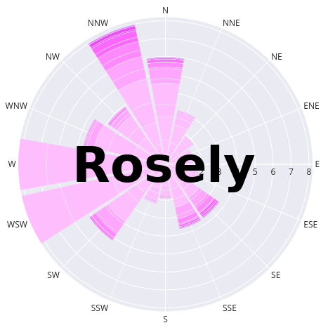
Here is an example use of the ‘return’ option that modifies the wind
rose after it’s creation by rosely by changing the background color
and margins:
Easy wind rose customizations
rosely makes it simple to experiment with different wind rose
statistcs options but also plot color schemes, this section of the
tutorial highlights some useful options to the WindRose.plot() method
for doing the latter.
First off there are three important keyword arguments to
WindRose.plot() that control the color schemes (colors,
template, and colors_reversed):
colorsis the name of thePlotlysequential color swatch or a list of your own RGB or Hex colors to passfor the stacked histograms (the first color in the list will be the most inner color on the diagram and them moving outwards towards higher wind speeds).template, this is the name of thePlotlytemplate that defines the background color and other visual appearences. You may also pass a customPlotly.pytemplate object.colors_reversedsimply allows for the automatic reversal of color sequences which may be useful because some color swatches range from light to dark while others range from dark to light tones.
A list of all provided colors (hint hover over them to view the Hex or RGB values themselves):
As for templates they are easily listed by the following:
>>> import plotly.io as pio
>>> pio.templates
Templates configuration
-----------------------
Default template: 'plotly'
Available templates:
['ggplot2', 'seaborn', 'plotly', 'plotly_white', 'plotly_dark',
'presentation', 'xgridoff', 'none']
Now, let’s try out some of these colors and templates!
>>> WR.plot(output_type='show', template='seaborn', colors='Plotly3', width=600, height=600)
Some color swatches may look better without colors reversed,
>>> WR.plot(output_type='show', template='xgridoff', colors='turbid', colors_reversed=False)
This final example not only shows different color schemes but that you can
pass additional useful keyword arguments that are accepted by
plotly.express.bar_polar such as title, and width to
WindRose.plot(). It also demonstrates that HTML can be embedded into
the plot title and an example of prefiltering the wind time series to
before calculating wind statistics, in this case to create a wind rose
for the winter months only.
>>> # reassign the wind data but sliced just for Dec-Mar
>>> WR.df = df[['ws','wd']].loc[df.index.month.isin([12,1,2,3])]
>>> # calculate the wind statistics (only necessary because not using default n bins)
>>> WR.calc_stats(normed=True, bins=6)
>>> WR.plot(
>>> output_type='show',
>>> colors='Greens',
>>> template='plotly_dark',
>>> colors_reversed=False,
>>> width=600,
>>> height=600,
>>> title='Eddy Flux Site on Twitchell Island, CA <br>Wind measured Dec-Mar<br><a href="https://ameriflux.lbl.gov/sites/siteinfo/US-Tw3">Visit site</a>'
>>> )
As we can see the winter wind system is substantially different from the average long-term wind which may be expected due to seasonal storm systems or temporally varying larger scale atmospheric circulations.