API Reference
This page documents objects and methods provided by Rosely.
Module contents
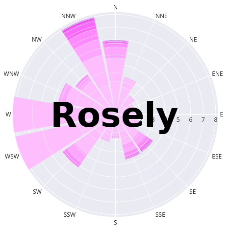
A small package for efficiently generating customizable and interactive wind rose diagrams. Once wind speed and direction is loaded into a pandas.DataFrame the package can create wind speed and direction statistics which are used to create windrose diagrams via Plotly’s polar bar chart function with multiple tools for easy plot customization.
WindRose class
-
class
rosely.WindRose(df=None)[source]¶ Bases:
objectManage data for calculating wind statistics and provide simple interface for creating customizable wind rose diagrams.
-
df¶ arbitrary
pandas.DataFramethat is assigned to aWindRoseobject that must contain wind speed and direction columns before using otherWindRosemethods.Type: pandas.DataFrame
-
theta_angles¶ array of 11.25 degree intervals for 16 point compass.
Type: numpy.ndarray
-
wind_df¶ calculated wind statistics produced by
WindRose.calc_stats()and used byWindRose.plot().Type: pandas.DataFrame
-
calc_stats(normed=True, bins=9, variable_names=None)[source]¶ Calculate wind speed and direction bins needed for generating wind rose diagrams.
After running
WindRose.calc_stats()with different options a new instance attributeWindRose.wind_dfis generated that contains the binned wind speed statistics. This attribute is in the form of apandas.DataFrameand can be used to create a histogram or saved to disk.Keyword Arguments: - normed (bool) – default True. If True compute wind speed/direction frequency bins that are normalized to sum to 100. If False frequency bins are counts of occurences of wind speed/direction.
- bins (int or list) – default 9. Number of wind speed and direction bins to
calculate. 9 is used because most
plotlycolor sequences are lenght 9 or 10 which are later used byWindRose.plot() - variable_names (None or dict) – default None. If none the wind speed
and wind direction columns in
WindRose.dfshould be named ‘ws’ and ‘wd’ respectively. Otherwise a dictionary that maps the respective columns to ‘ws’ and ‘wd’ should be provided.
Returns: None
Example
Assuming you have a
pandas.DataFrameloaded that has wind speed and direction columns titled ‘wind_speed’ and ‘wind_direction’ and the dataframe is nameddf:>>> from rosely import WindRose >>> WR = WindRose(df) >>> names = {'wind_speed':'ws', 'wind_direction':'wd'} >>> WR.calc_stats(normed=False, bins=8, variable_names=names)
Now
WR.wind_dfshould have the appropirate statistics and theWindRose.plot()will use these statistics for the polar stacked histogram (wind rose).
-
df pandas.DataFramecontaining input time series wind data needed to runWindRose.plot().
-
plot(output_type='save', out_file=None, colors='Plasma', template='plotly_dark', colors_reversed=True, **kwargs)[source]¶ Create interactive wind rose diagrams with easily customizable options using Plotly’s polar bar chart.
Keyword Arguments: - output_type (str) – default ‘save’. If ‘save’ save graph to
out_file. Other options: ‘show’ will show in a new tab in web browser or within a Jupyter Notebook, and ‘return’ will return the plotly figure for further manual customization/modification or use in custom workflows like saving as a subplot with other plot figures. - out_file (None or str) – default None. If
output_type='save'then save to specified path, if None save to current working directory as “windrose.html”. - colors (str) – default ‘Plasma’. Name of Plotly color swatch or sequence to use for coloring bins from center outward on wind rose. See Tutorial for examples and all options. Can also pass a list of hex or rgb colors of your own.
- template (str) – default ‘plotly_dark’. Name of Plotly template for background theme/colors on wind rose.
- colors_reversed (bool) – True. If True reverse the colors in
colors. The first color in the sequence will be used for the lightest wind speed bin. - **kwargs – other keyword arguments are passed to the
plotly.express.bar_polarplot function, e.g. title or width.
Returns (None or
plotly.graph_objects.Figure)Example
Assuming a
pandas.DataFrameobject called “df” has been loaded and contains columns ‘ws’ and ‘wd’ with wind speed and direction,>>> from rosely import WindRose >>> WR = WindRose(df) # df already loaded pandas dataframe >>> # if you skip running WR.calc_stats the defaults will be used >>> WR.plot(output_type='show', colors='Greens', >>> colors_reversed=False)
This will produced a normalized frequency wind rose (frequency 0-100 percent) with 9 bins. To specify the to use count frequency or a different number of bins use the
WindRose.calc_stats()method before runningWindRose.plot().Tip
To see a list of all provided color sequences provided by Plotly,
>>> import plotly.express as px
>>> px.colors.sequential.swatches()
All of the listed color schemes can be passed to the
colorsarugment ofWindRose.plot().- output_type (str) – default ‘save’. If ‘save’ save graph to
-
theta_angles Used by autodoc_mock_imports.
-
theta_labels= ['N', 'NNE', 'NNE', 'NE', 'NE', 'ENE', 'ENE', 'E', 'E', 'ESE', 'ESE', 'SE', 'SE', 'SSE', 'SSE', 'S', 'S', 'SSW', 'SSW', 'SW', 'SW', 'WSW', 'WSW', 'W', 'W', 'WNW', 'WNW', 'NW', 'NW', 'NNW', 'NNW', 'N']
-